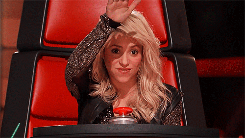
People. Love. Buttons. From pressing every button in the elevator as kids (and sometimes grown-ups), to the trope of the forbidden “big red button” always getting pressed, there’s something irresistible about pressing buttons. I mean, who hasn’t wanted to do this on The Voice?
There are actually a lot of things that make pressing buttons tantalizingly tempting. And when it comes to trying to direct people to a product of yours or trying to get them to click into your shop or to follow it? Buttons can make you extra click-worthy. Here’s a little bit about the psychology of buttons, why buttons work, and how you can use them.
Why Do We Love Buttons?
Buttons are a reward system. When we push a button, we expect something to happen – and usually, it’s not a bad thing. Look at the ever-addicting text message: we essentially have to push (or swipe) a button to get the message. Like a rat in a lab tapping a pedal that makes food drop into the cage.
You can even take it further by considering the power that comes with pressing a button to make things happen. That’s why seeing a DO NOT PRESS button is so tantalizing – it’s “reactance theory,” which says that if our freedom of choice feels threatened, we want to re-gain that freedom, making us want to do exactly what we’re told not to do (Gizmodo). It’s the power of causing an effect.
Why Use Buttons?
Whether it says “Buy Now!”, “Sign Up Here!”, or “CONGRATULATIONS! YOU WON A MILLION DOLLARS” (never press that button), we expect online buttons to be our cue to do something (kissmetrics) – a proper Call to Action (CTA). People go to sites now expecting to find a button prompting them to act (kissmetrics), which may be one reason why people are so quick to give up on a purchase when a site doesn’t make a button easy to find – they expected a button, and no cigar.
Overcomplicated or frustrating site navigation like that is the top reason shoppers decide not to buy (marketingland). That’s why you need to make your button easy to find (kissmetrics). The less steps and hoops to jump through you give your customer to get to a button, the less reason they have to say “screw this” and give up. Plus, since a big part of e-commerce is all about impulse buys; don’t give people time to think “this is taking awhile…do I really need this shirt?” (marketingland)
What Makes a Good Button?
Entrepreneur.com described the four key elements to a solid button as:
- ROUNDED: Curved edges in buttons direct attention to the button’s center where the important copy will be, where square edges draw attention away from the center (keepitusable). Plus, rounded edges just look more button-y, dontcha think?
- BIG: The size of a button = how important it seems to a person (keepitusable).
- TAPPABLE: We all know the frustration of pressing a button that doesn’t at least look like it clicks.
- TESTED: Test what button designs convert best for YOUR audience!
There’s no one secret formula to the perfect button – it depends on everything from audience gender to the background color of your site. But here are some pointers:
Color is king
There’s a lot of psychology that goes into the effect certain colors have on us. There’s no one best color for buttons, but here’s a quick guide of things to consider:
- Go with colors that are complementary to your site’s color to make them stand out.
- Smaller buttons should have brighter colors, larger buttons should have less in-your-face bright colors (pauloslager).
- Red is attention-grabbing, blue is great for impulse buyers, orange demands attention and urgency (good for “buy nows”) and is associated with inexpensive things (good for sales), and green, of course, gives the “go greenlight”, which is always good (marketingland and Entrepreneur)
Copy is key
You don’t have a ton of word-space on a button, but rather than just making a general“click here” button, make the message short, sweet, and specific/enticing. A CTA isn’t a general “click here” message – it gives the user a specific reason to click it.
A few tips:
- Just adding the word “now” boosts your click rates by giving extra urgency (and appealing to those impulse buyers).
- There’s a 90% better conversion rate when you use first-person language on your button, like “start my shop” rather than “start your shop”.
- Use active verbs like “Start” and “Get” – something that prompts people to take action.
Where Should You Use Buttons?
- In your shop or blog: Buttons don’t just have to be all about “Buy Now!” They’re also great for prompting people to stay caught up with what you’re doing – it’s what Twitter and Tumblrs thrive on. Threadless Artist Shops automatically add a FOLLOW button in your shop, which automatically sends emails to your subscribers when you add a new product.
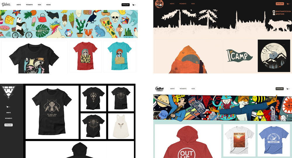
The FOLLOW buttons in Elebea‘s, ND Tank’s, Eliza’a, and Gintron’s Artist Shops Speaking of emails…
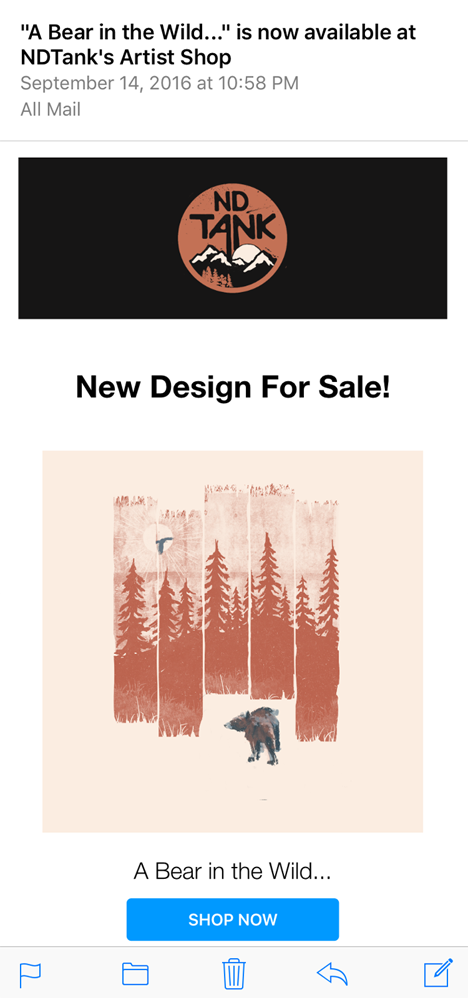
- Have buttons in emails: Look at the way emails from stores you sign up for look. “Shop Now” cues will often be in button form, vs the “unsubscribe” button, which is really just a tiiiiny hyperlinked word at the bottom of the email. The emphasis is clear. In the emails sent to your Artist Shop followers that I mentioned, every email looks a little something like this, with a big CTA button at the bottom:
- In your blog posts: Having buttons at the bottom of your blog posts is a great way not only link people to offers them (free texture downloads, gift codes, etc.), it’s also a great way to link people to your shop, new products, etc. Having trouble creating a button in your blog? Here’s a lifehack: create a button-looking JPEG in Photoshop and hyperlink the image itself in your blog. Just like when people click on pictures in your blog to open them up, clicking this will take them where you want them to go – totally button-worthy.
Push your customers’ buttons – er, have them push yours – and be sure to be click-worthy.

We’re an artist community built on the power of helping each other succeed — if you’re reading this and have tips of your own to share, please do so in the comments! Thank you!
Illustrations done by the amazing Katie Lukes
Related Posts