In college, I remember talking to a guy who had a disorder called synesthesia, which caused him to see a splotch of color appear whenever anyone spoke (my voice was purple). He told me the experience was so intense that there are people he can’t even talk to because the ‘color of their voice’ is too gross. Such is the power of color. If you’re seeking the secret to what colors are guaranteed to lead to more sales, here it is: there is no sure-fire secret. I know, kind of a bummer. Because there are dozens of factors that affect how we see color and how it affects us, the psychology of color and e-commerce isn’t an exact science. But it’s is hugely powerful, so much so that sometimes you can even boost sales with color. The key is knowing how, where, and when to use it to attract customers to your online shop or website.
WHY COLOR CAN HELP BOOST YOUR SALES
Enforces your brand personality and Creates associations
When we look at a color, a whole game of brain telephone happens that results in a release of hormones, causing mood, emotion, and behavior fluctuations. This is why colors can play such a role in your brand’s identity and how it makes people feel, and why it’s weirdly uncomfortable to see certain colors in a mismatched context, like a baby’s bedroom painted dark red (that’s just creepy).
Just like with lifestyle photos, if your brand colors don’t match your brand’s personality, people will be turned off. Entrepreneur stated, “Predicting color appropriateness in relation to the product is more important than the actual color itself.” How likely someone is to buy your product has been shown to be super affected by colors because they influence how consumers view a brand’s personality. It’s kind of like trying to fit in with the cool kids. Pick colors that go with the brand personality and vibe you’re trying to create.
ATTRACT PEOPLE TO YOUR BRAND
Forget the whole “don’t judge a book” thing. Color is one of the first things we notice and judge. The Institute for Color Research found that 60-90% of shoppers subconsciously make decisions purely based on color. And Neil Patel of QuickSprout reported that color is up to 85% of why we end up buying something. Shopify even reported that the right mix of colors with your brand can mean the difference between a customer returning or never coming back. So the right balance of colors that align with your brand can attract (or deter) people to your site, even if they aren’t aware of it.

Boosts familiarity
What do you think when you see the above colors? If you thought Facebook, Twitter, and McDonalds, boom: nailed it. Brands that consistently use certain colors with their logos, ads, etc. can be recognized just from that color. And studies have shown that our brains prefer brands we recognize (Entrepreneur). Which makes sense – when you’re shopping, the brands you recognize are the first to come to mind.
Embrace the differences
There are a ton of factors that play into how certain colors make us feel. Take cultural differences; In India, red is powerful and represents marriage, wealth, and power. But in South America, it’s used for mourning. In Western cultures, white represents purity and is worn by brides. In Japanese culture, white is worn for funerals (practical ecommerce). Western cultures associate yellow with cowardice, while in Japan, it means courage (huffingtonpost). And look at gender differences; Overall, Men prefer bold, bright colors and darker shades while women prefer softer colors and light tints. Men overall prefer blues, greens and blacks, but purples, oranges and browns not so much. Women overall prefer blue, purple, and green (nope, not pink), where grey, orange, and brown should be avoided when trying to appeal to that demographic (Entrepreneur). Even just context is huge. Think about the feeling orange and black together give you in the Halloween context vs the Harley Davidson logo context:
Rather than looking at these differences and table-flipping right on out of dealing with the sometimes contradictory world of color, wait! You can use these differences to your advantage. If your audience is largely a certain cultural or gender demographic, use that information to figure out what colors you should consider using more of. You can even use Google Analytics to track where the bulk of your traffic is coming from and to help pinpoint your demographic.

Can boost conversion rates
Using colors in the right places can draw customers’ attention to CTA buttons and ads. Overall, bright colors get more clicks (kissmetrics), especially red, green, yellow, and orange.
- Red: creates excitement and urgency.
- Green: means “go” and is pleasing to the eye, yellow is cheerful while causing just the right amount of anxiety and buyer’s pressure.
- Orange: creates a feeling of impulse, but also indicates something is cheap or discounted.
Keeping your buttons all one color so that people recognize that as the “click color” also doesn’t hurt.
HOW TO PUT COLOR INTO USE
Be consistent
The key with using color to associate with your brand is to always. be. consistent. Using too many different colors to represent your brand in your various social media channels will just cause confusion and will be harder to cause people to make associations with your brand. Use the same colors you want to use for your brand across your social media channels. Consider making a style guide that includes “your” colors!
Use it SPARINGLY
When it comes to your site, white is your best friend. Having a white – or a light – background will make your products stand out more and will draw focus to the areas where you DO use colors. Look at the Artist Shops customization bar (below) – the pre-set color group suggestions use color sparingly and keep the colors in the same family – a good guideline to follow when customizing your own! 
Use Strategically
Don’t flood your site with color – use it where it matters and avoid color overload. When it comes to color and CTAs, “The Isolation Effect” becomes your best friend. This effect says that the more something stands out, the better you remember it. Using a splash of color for banners, icons, headers, and CTA buttons is a great way to draw attention to where you want to user to look. You want things that you put a color to to stand out – not to fade into an overly colorful background.
Make sure the color flows with your product
As mentioned before, there’s no such thing as a magic list of good vs bad color. Context matters – make sure the colors you’re choosing to go with your brand (in logos, as your site headers, site banners, ads, etc.) align with your brand. Look at how these Artist Shop owners use (and don’t overuse) color.
Test it
Don’t be afraid to test out different colors to see which colors work best! You don’t have to get it right the first time – see what colors work best for you and work best for customers. Google Analytics is a good tool to use to track clicks.
WHAT DO CERTAIN COLORS ‘MEAN’
If you’ve ever looked this up before, you probably know that the meaning of colors can be full of contradictions. We’ve compiled the meanings of these colors that seem to be pretty consistent across sites that talk about the psychology of color!

sources:
- “The Psychology of Color in Marketing and Branding” (Entrepreneur)
- “What Colors Mean in Other Cultures” (Huffington Post)
- “Color Psychology for Ecommerce” (Shopify)
- “The Psychology of Color in Ecommerce” (woocommerce)
- “How Do Colors Affect User Choices and Purchases?” (KISSmetrics)
- “Color Psychology and Ecommerce” (Practical Ecommerce)
- “Using Color Psychology to Increase Your eCommerce Sales” (Ecommerce Insiders)
- “Using Color Psychology to Boost Sales” (msdlab)
- “The Psychology of Color: How it Affects the Way We Buy” (hubspot blog)
. . .
We’re an artist community built on the power of helping each other succeed — if you’re reading this and have tips of your own to share, please do so in the comments! Thank you!
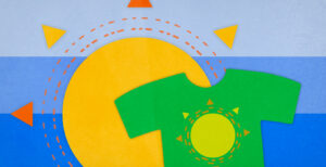
Illustrations done by the amazing Katie Lukes
Related Posts