You know how sometimes menus have amaaazing pictures of their burgers? And so you order that burger? But what you get looks more like someone stepped on a piece of bread with some soggy meat in it?
We don’t want that to happen with your shirts. And hey, if your designs are of food, then we don’t want your food to look like that either.
Here’s how to format your designs for your Threadless Artist Shop so that when they print, they look as awesome as you intended them to!
Get Yo Files Right
In order for your design to look awesome, we need to get it in a format that sets it up to look that awesome.
So the important parts there:
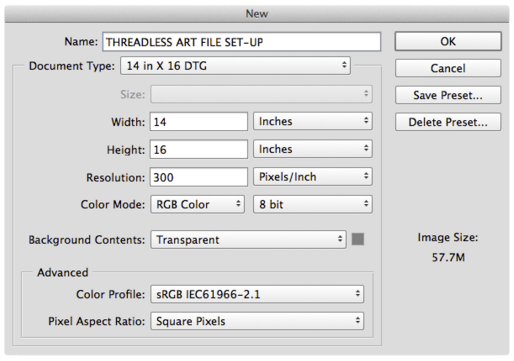
- 300 dpi
- 14×16 canvas (4200px*4800px)
- RGB Mode
- Transparent background – to do this, save as .PNG (then it can go on all apparel colors!)
Why Sizing Matters
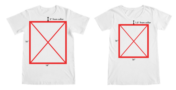
If you’re wondering what the image size is going to look like when it’s actually on the shirt, check it out:
On the left is a men’s medium, on the right a women’s medium. The size difference is because women’s sm/med can’t fit on the larger printing palette without getting distorted. SO we have to have them on a smaller palette. But women’s large and up will receive the same sizing as the guy’s palette.
Re-sizing Loophole!
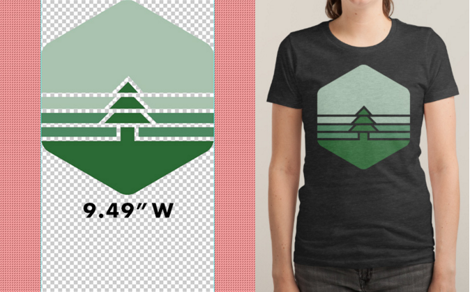
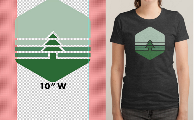
If you really want to work around that re-sizing, you can…as long as your design meets a certain criteria. We have a ‘trim script’, and if your design fits within the centered 9.49” of the 14?x16? canvas, voila! It won’t get re-sized (except in smaller garments, especially tanks).
BUT, if it doesn’t fit in that area? Even by just a couple pixels? Rut roe, re-sizing happens.
Colors
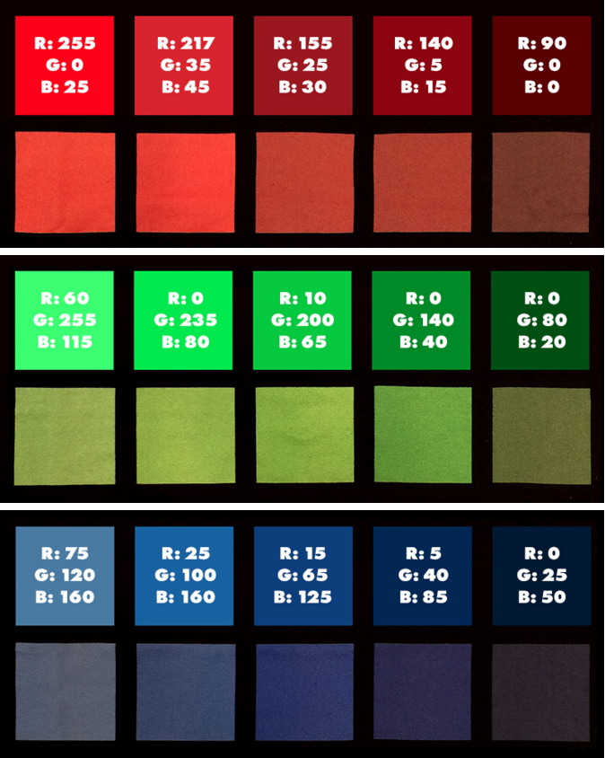
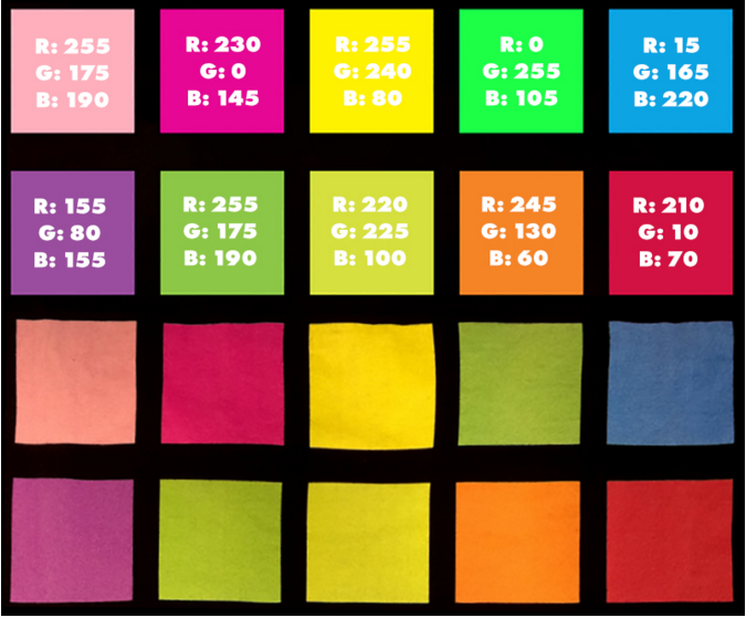
Here’s what some colors will look like when translated onto a garment. Note that bright reds, cyans, and greens are the hardest to get exactly as you want them.
And here’s some ways you can get closer to those neon and pastel colors:
How to Get That Batman-Level, I-AM-THE-NIGHT Black Hue
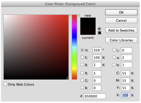
If you’ve messed around with colors before (which, as a designer at any level, I’m sure you have), you know that ‘true black’ is usually #000000, if you want a super dark black through our printers – especially on light garments – use the CMYK values 55, 55, 55, 100.
Like so:
Transparency Warning
Transparent parts of a design can look really cool when you’re looking at it digitally. But sometimes that doesn’t translate so great into the real life.
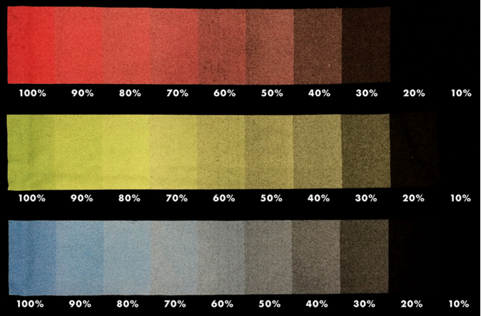
Here’s a look at how different opacities will print. We recommend staying about 30% opacity. This technique, by the way, is awesome for making shadows tonal to different blank colors on one art file. (Pro-Tip: set the color to black and adjust the transparencies from there to do so!)
For more details on our printing process or anything you see here, check out this help post.

